Three combinations to try
Want actual font products to compare? Explore five coordinated font duos with designer specimens and clear roles.
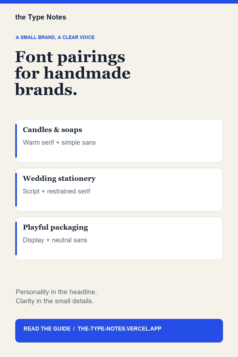
Warm serif + straightforward sans serif
Try this for candles, soaps, ceramics, or artisan food. Use the serif for a product name and the sans serif for scent, size, and supporting details. Test both on a small label before choosing a family.
Expressive script + restrained serif
This can suit wedding stationery and personalized gifts. Keep the script to names or a short phrase. Dates, instructions, and longer details need the calmer family.
Bold display + neutral sans serif
Try a display style for retro apparel or playful packaging. Let it own the headline, and avoid asking it to carry a paragraph.
Test with real content
Set your longest product name, your shortest name, a price, and a line of descriptive text. Compare the spacing and hierarchy at the actual output size. If everything wants attention, simplify the display font or reduce its use.
Use size and weight before adding a third family. A strong pairing should work in a listing image, on packaging, and on a small printed label.
Browse coordinated font duos
A coordinated duo can shorten your search, but it still needs testing with your words. On Creative Fabrica, search for “font duo” and inspect the included styles, preview characters, and current terms before buying or downloading.
Browse Creative Fabrica font options
These style examples use your device’s existing fonts and are not previews of a particular Creative Fabrica product.
Affiliate disclosure: purchases through our Creative Fabrica links may earn us a commission at no extra cost to you.
Keep this guide on Pinterest.
Save a quick reminder and return to the full guide when you are planning your next product.
Keep exploring
5 font duos for handmade brands: give each font a role.