Understand the direction
A generated image may contain invented names, inconsistent characters, and effects that are baked into the artwork. There may be no corresponding font file. Treat the image as a visual brief: record the shape, weight, spacing, movement, and palette. Then compare real products that share some of those qualities.
Your 6-product shortlist
Choose the role your font needs to play first. Each product below links to its exact Creative Fabrica listing, where you can inspect characters, current access, and the applicable license.
| Font product | Type direction | Try it for |
|---|---|---|
| Bubblegum | Bold display + outline + script | A rounded display reference |
| Andryan | Retro script | A flowing script reference |
| Pixel Forge | Pixel display + 3D variant | A pixel or dimensional reference |
| Elegant Fashion | Modern serif | An editorial serif reference |
| Doodletron | Sketchy outline display | A sketched outline reference |
| ABC Dot | Dotted display | A dotted decorative reference |
See the fonts and choose their roles
Selected from designer specimens and product information checked October 2, 2026. These are editorial starting points; test your own text and production method.
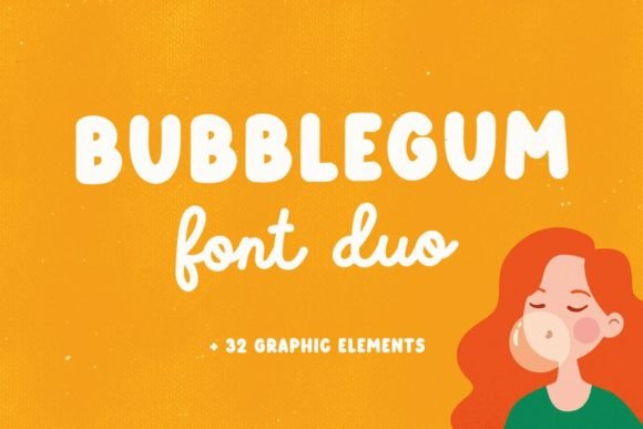
Bubblegum
By Julia_Volkova Check current access
A rounded display reference
This listing supplies real display, outline, and script components to compare when the reference centers on soft, playful lettering.
- Give it this role
- Match the rounded structure first; rebuild effects separately.
- Before you choose
- Check the actual designer specimen rather than assuming the generated word uses this font.
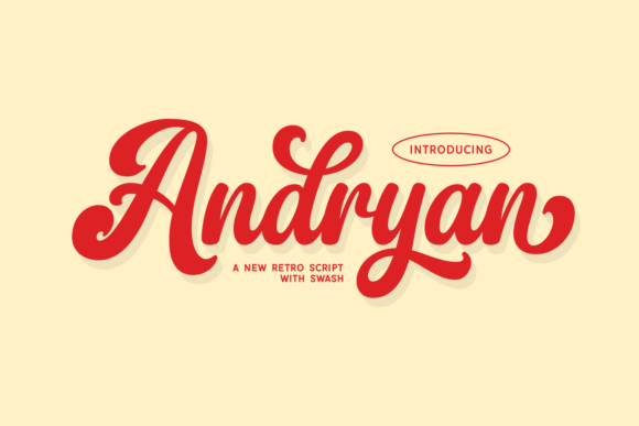
Andryan
By Creative Fabrica Fonts Check current access
A flowing script reference
A real script product gives you a practical route when the image suggests connected letters and a personal gesture.
- Give it this role
- Match movement rather than a generated flourish pixel for pixel.
- Before you choose
- Confirm your exact phrase and required characters.
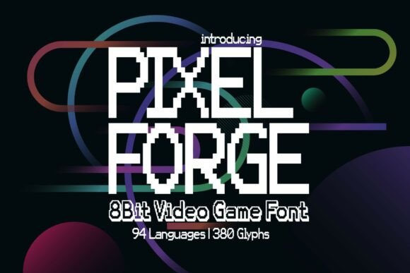
Pixel Forge
By HipFonts Check current access
A pixel or dimensional reference
Pixel Forge offers real standard and 3D directions to inspect when the reference suggests grid-based or dimensional lettering.
- Give it this role
- Choose the structure before matching shadows or colors.
- Before you choose
- Compare both listed variants with your intended wording.
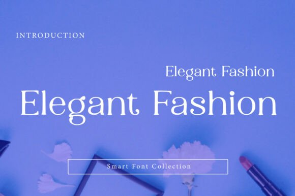
Elegant Fashion
By Wow Magic Subscription listing
An editorial serif reference
A modern serif candidate makes sense when the reference relies on contrast and composed headline shapes.
- Give it this role
- Match the editorial role, not an invented font name.
- Before you choose
- Inspect fine details at your actual output size.
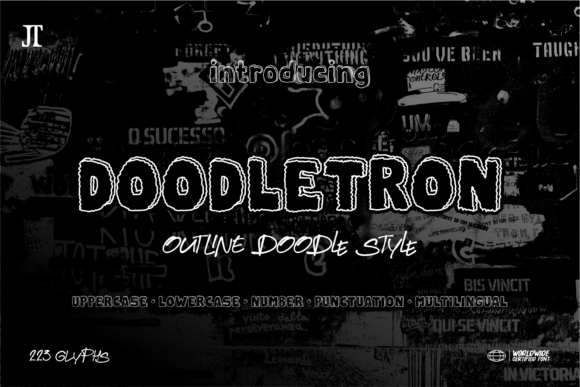
Doodletron
By Joni type Check current access
A sketched outline reference
The textured display direction provides a genuine product to inspect for a hand-drawn, hollow-letter mood.
- Give it this role
- Use it for a short large word with simpler support.
- Before you choose
- Check whether the texture stays clear in your final layout.
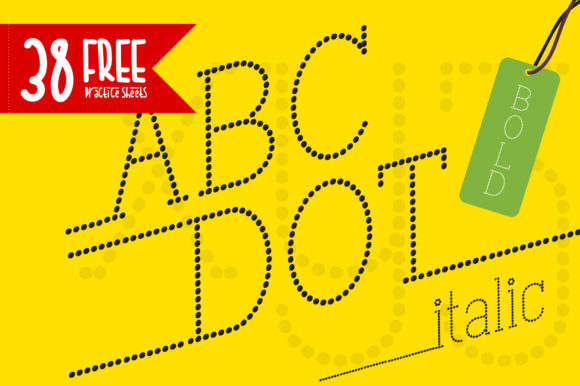
ABC Dot
By pointsandpicas Check current access
A dotted decorative reference
ABC Dot gives you a real dotted alphabet to compare if separate marks are the reference’s defining feature.
- Give it this role
- Keep required information in solid type.
- Before you choose
- Treat it as decorative display, not as a verified tracing or educational font.
Build your own layout
- Describe the image in five plain words, such as rounded, heavy, upright, spacious, and pink. Ignore any invented font label.
- Compare the exact product listings using your final phrase. Record what matches and what differs; do not claim an exact match without evidence.
- Choose a usable font, then recreate your own palette and layout. If no product is close enough, change the design direction rather than advertising a nonexistent file.
Check the final result
- Say “similar style” when the relationship is inspiration.
- Show actual designer specimens alongside recommendations.
- The free shortlist is a guide with product links, not a bundle of font files.
These recommendations are based on product information and designer specimens, not hands-on production testing. Inspect the exact listing, try your own text where a preview is available, and make a proof for your output method.
Choose your access and check the license
Product access can change. The access labels above describe what was shown when checked, not a promised price or permanent offer. Open each exact listing to confirm how you can obtain it and whether it is included in the plan you are considering.
For one project, compare buying only the fonts you need where a single purchase is offered. For several projects with different styles, compare the full subscription charge over the same billing period. A subscription listing does not mean a font is permanently free.
Read the terms for your purchase method and intended use, particularly editable templates, font embedding, and print-on-demand. Keep font files out of customer downloads unless the applicable terms expressly allow distribution.
Work through the subscription comparison or calculate your font budget.
Save the shortlist and compare your budget
Download the free font shortlist with product names, designers, style notes, and exact links. This is a free reference guide, not a download of font files. Product prices and access conditions vary.
Before choosing a plan, compare the fonts you actually expect to use over its full billing term. The font subscription calculator lets you model that comparison with your own prices.
Questions before you choose
Is the exact font from the generated pin available?
Not necessarily. Generated lettering may not correspond to an existing font file. These are real products in related directions, not promised exact matches.
Does the free shortlist include font files?
No. It is a free reference list with designer names and product links. Obtain fonts through their provider under the applicable terms.
Keep this guide on Pinterest.
Save a quick reminder and return to the full guide when you are planning your next product.