Understand the direction
A board with many fonts is a research sheet, not a finished typography system. Give each candidate the same sample phrase and the same amount of space. This makes the differences easier to see. Keep notes about the intended audience and output format alongside the attractive examples.
Your 6-product shortlist
Choose the role your font needs to play first. Each product below links to its exact Creative Fabrica listing, where you can inspect characters, current access, and the applicable license.
| Font product | Type direction | Try it for |
|---|---|---|
| Bubble | Rounded bubble display | Soft and playful |
| Andryan | Retro script | Flowing and personal |
| Retro Pixel | Pixel display + italic | Grid-based and nostalgic |
| Elegant Fashion | Modern serif | Editorial and composed |
| Doodletron | Sketchy outline display | Sketchy and informal |
| Outline | Outline sans serif | Hollow and restrained |
See the fonts and choose their roles
Selected from designer specimens and product information checked October 2, 2026. These are editorial starting points; test your own text and production method.
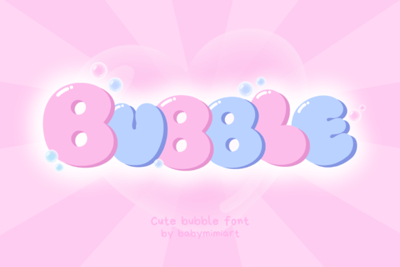
Bubble
By Babymimiart Check current access
Soft and playful
Use this rounded display direction as the friendly end of your comparison. Its purpose is to show how a short word can carry the composition.
- Give it this role
- Potential main headline, not the information paragraph.
- Before you choose
- Compare the same word with your more structured candidates.
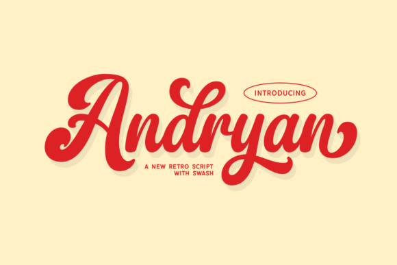
Andryan
By Creative Fabrica Fonts Check current access
Flowing and personal
A script direction demonstrates how movement changes the mood without relying on a bright palette.
- Give it this role
- Potential brief personal accent.
- Before you choose
- Test punctuation and the longest phrase in the project.
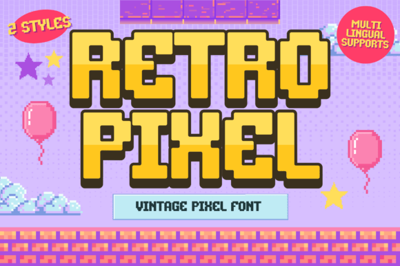
Retro Pixel
By Brown Cupple Fonts Check current access
Grid-based and nostalgic
Pixel lettering gives the board a visibly digital structure, distinct from handwriting and rounded display type.
- Give it this role
- Potential thematic label or retro headline.
- Before you choose
- Check the exported word at the intended size.
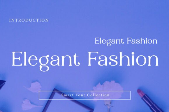
Elegant Fashion
By Wow Magic Subscription listing
Editorial and composed
A modern serif direction lets you compare a calmer hierarchy with the more playful candidates.
- Give it this role
- Potential editorial headline.
- Before you choose
- Inspect fine strokes on your selected background.
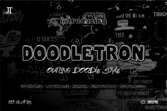
Doodletron
By Joni type Check current access
Sketchy and informal
The textured outline direction adds a hand-drawn option without claiming that your generated pin lettering is an available font.
- Give it this role
- Potential large sketched word.
- Before you choose
- Make sure the texture survives the smallest output.
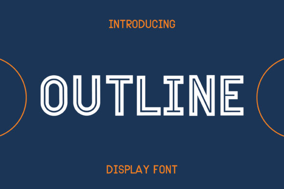
Outline
By Pila Studio Check current access
Hollow and restrained
A cleaner outline alphabet offers a lighter edge than the sketchy option, useful for comparing decorative structure.
- Give it this role
- Potential large accent with solid supporting text.
- Before you choose
- Check stroke visibility before placing it over an image.
Build your own layout
- Write one sample phrase and one information line. Use them for every candidate so wording does not bias the comparison.
- Assign a reason to each direction: friendly, personal, nostalgic, editorial, sketchy, or light. Eliminate choices that do not match the project.
- Choose one headline direction and one supporting role. Save the remaining candidates for later instead of putting all six in the finished layout.
Check the final result
- A comparison board can contain six fonts; a finished design usually needs far fewer voices.
- Keep exact designer names in your notes because product names may repeat.
- Download the free shortlist as a reference, then verify current product access before obtaining fonts.
These recommendations are based on product information and designer specimens, not hands-on production testing. Inspect the exact listing, try your own text where a preview is available, and make a proof for your output method.
Choose your access and check the license
Product access can change. The access labels above describe what was shown when checked, not a promised price or permanent offer. Open each exact listing to confirm how you can obtain it and whether it is included in the plan you are considering.
For one project, compare buying only the fonts you need where a single purchase is offered. For several projects with different styles, compare the full subscription charge over the same billing period. A subscription listing does not mean a font is permanently free.
Read the terms for your purchase method and intended use, particularly editable templates, font embedding, and print-on-demand. Keep font files out of customer downloads unless the applicable terms expressly allow distribution.
Work through the subscription comparison or calculate your font budget.
Save the shortlist and compare your budget
Download the free font shortlist with product names, designers, style notes, and exact links. This is a free reference guide, not a download of font files. Product prices and access conditions vary.
Before choosing a plan, compare the fonts you actually expect to use over its full billing term. The font subscription calculator lets you model that comparison with your own prices.
Keep this guide on Pinterest.
Save a quick reminder and return to the full guide when you are planning your next product.