Understand the direction
Start with the available space after allowing for the hole, ribbon, and edge margin. Those physical constraints matter more than the mockup’s empty background. Treat the recipient’s name, greeting, and sender as three separate information levels, even if the tag uses only two font styles.
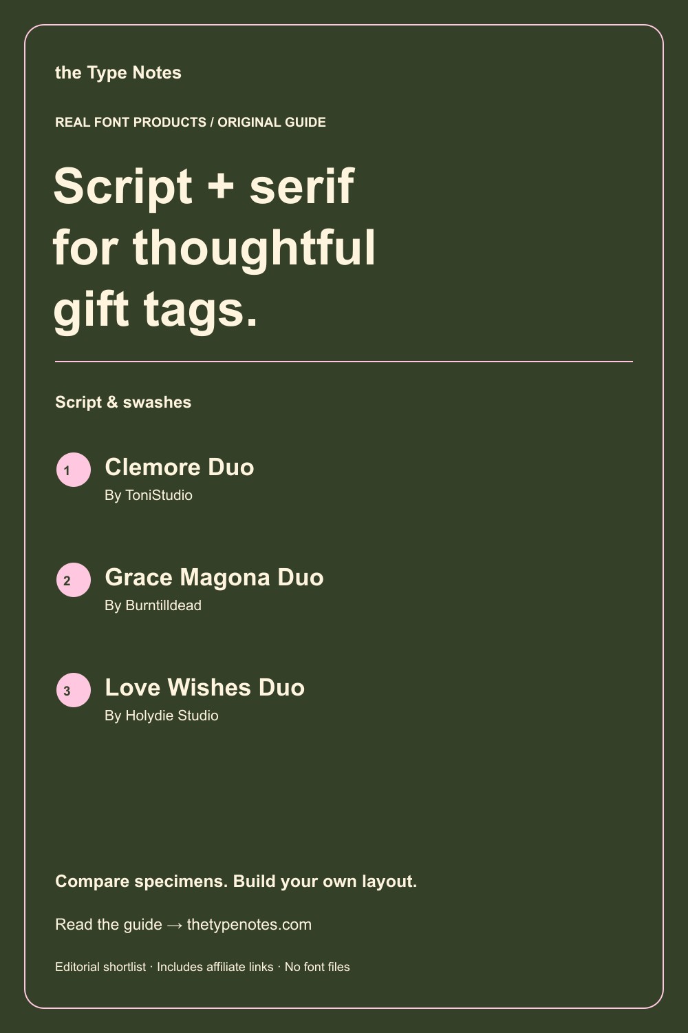
Your 3-product shortlist
Choose the role your font needs to play first. Each product below links to its exact Creative Fabrica listing, where you can inspect characters, current access, and the applicable license.
| Font product | Type direction | Try it for |
|---|---|---|
| Clemore Duo | Serif + script | A balanced name-and-message pairing |
| Grace Magona Duo | Bold serif + script | A stronger headline with a personal detail |
| Love Wishes Duo | Serif display + script | A decorative stationery direction |
See the fonts and choose their roles
Selected from designer specimens and product information checked October 2, 2026. These are editorial starting points; test your own text and production method.
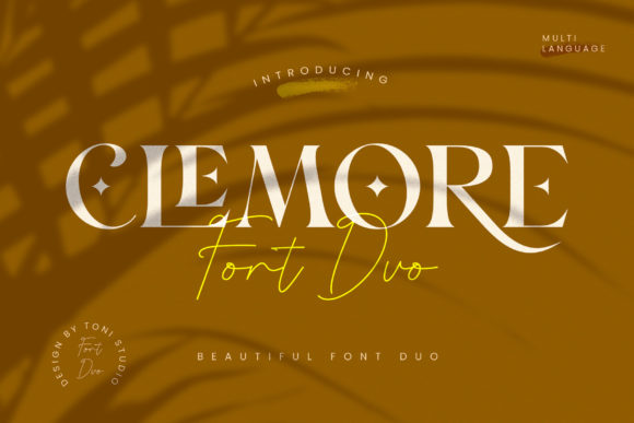
Clemore Duo
By ToniStudio Subscription listing
A balanced name-and-message pairing
The serif-and-script direction gives you a useful starting point for a personal name above a restrained greeting.
- Give it this role
- Script for the name, serif for the message.
- Before you choose
- Test the longest recipient name and the complete greeting on the smallest tag.
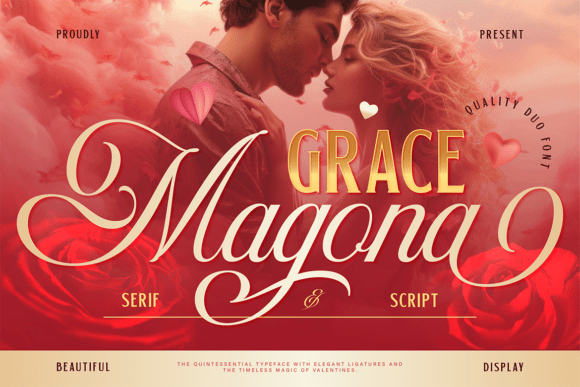
Grace Magona Duo
By Burntilldead Subscription listing
A stronger headline with a personal detail
Grace Magona Duo combines bold serif and script directions. The stronger headline can anchor a simple gift tag.
- Give it this role
- Serif for the occasion; script for a brief dedication.
- Before you choose
- Make sure bold letters do not crowd the ribbon hole or outer margin.
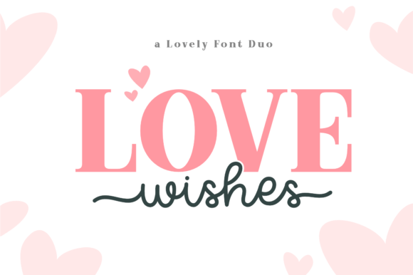
Love Wishes Duo
By Holydie Studio Subscription listing
A decorative stationery direction
Love Wishes Duo is another pairing option to inspect when the occasion calls for a more expressive personal detail.
- Give it this role
- One expressive line with an uncomplicated supporting message.
- Before you choose
- Compare the listing’s components with your actual small-format wording.
Build your own layout
- Draw a safe area that excludes the hole and the space occupied by a tied ribbon. Keep all required text inside it.
- Set the greeting in the quieter component first, then fit the name above it. Do not sacrifice the greeting’s readability for a flourish.
- Print a sheet with the longest and shortest names together. Check that both look intentional before producing the whole set.
Check the final result
- Leave enough space for handwriting if a customer will fill in a name.
- Tiny script is rarely improved by adding an outline.
- For editable templates, check the applicable font-embedding and customer-use terms.
These recommendations are based on product information and designer specimens, not hands-on production testing. Inspect the exact listing, try your own text where a preview is available, and make a proof for your output method.
Choose your access and check the license
Product access can change. The access labels above describe what was shown when checked, not a promised price or permanent offer. Open each exact listing to confirm how you can obtain it and whether it is included in the plan you are considering.
For one project, compare buying only the fonts you need where a single purchase is offered. For several projects with different styles, compare the full subscription charge over the same billing period. A subscription listing does not mean a font is permanently free.
Read the terms for your purchase method and intended use, particularly editable templates, font embedding, and print-on-demand. Keep font files out of customer downloads unless the applicable terms expressly allow distribution.
Work through the subscription comparison or calculate your font budget.
Save the shortlist and compare your budget
Download the free font shortlist with product names, designers, style notes, and exact links. This is a free reference guide, not a download of font files. Product prices and access conditions vary.
Before choosing a plan, compare the fonts you actually expect to use over its full billing term. The font subscription calculator lets you model that comparison with your own prices.
Keep this guide on Pinterest.
Save a quick reminder and return to the full guide when you are planning your next product.
Keep exploring
Elegant script fonts for short quotes
Script fonts for thank-you cards