Understand the direction
Bubble lettering feels friendly because the shapes take up space without sharp edges. A short phrase gives those shapes room to work. A long product description usually needs a quieter companion. Judge the counters inside letters as carefully as the outside silhouette: a pleasing round shape can become a dark blob when reduced.
Your 3-product shortlist
Choose the role your font needs to play first. Each product below links to its exact Creative Fabrica listing, where you can inspect characters, current access, and the applicable license.
See the fonts and choose their roles
Selected from designer specimens and product information checked October 2, 2026. These are editorial starting points; test your own text and production method.
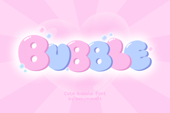
Bubble
By Babymimiart Check current access
A single, cheerful headline
The rounded designer specimen is a useful starting point when the word itself should feel soft. Keep the line short and let the surrounding space supply the calm.
- Give it this role
- Use a plain sans serif for dates and supporting copy.
- Before you choose
- Inspect your repeated letters and the smallest counters in the provider preview.
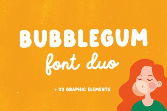
Bubblegum
By Julia_Volkova Check current access
A headline with a secondary handwritten line
This particular Bubblegum listing includes display, outline, and script components. That offers a coherent starting palette when a composition needs two voices.
- Give it this role
- Display for the main word; script for a brief accent.
- Before you choose
- Compare the components using the same phrase; avoid decorating every line.
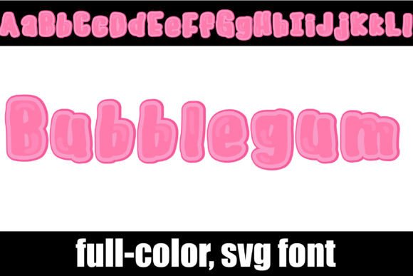
Bubblegum
By Illustration Ink Check current access
A pink, full-color display accent
Illustration Ink’s Bubblegum is a color SVG font. Its built-in appearance suits a digital accent if your design application supports that format.
- Give it this role
- Keep captions neutral so the pink word stays dominant.
- Before you choose
- Verify color-font support and export behavior in your app before obtaining it.
Build your own layout
- Write the final headline before comparing fonts. Test one word, two words, and the longest version you are likely to publish.
- Place the word on a plain cream background first. Add a shadow only after the letter shapes read clearly without one.
- View the finished composition at phone size. If the headline collapses, shorten it or increase its share of the layout rather than adding another outline.
Check the final result
- Avoid presenting a generated lettering image as an available font file. The shortlist offers similar directions, not exact replicas.
- Treat a color SVG font as a separate compatibility decision from ordinary outline fonts.
- Use one visual effect at a time so rounded shapes remain the subject.
These recommendations are based on product information and designer specimens, not hands-on production testing. Inspect the exact listing, try your own text where a preview is available, and make a proof for your output method.
Choose your access and check the license
Product access can change. The access labels above describe what was shown when checked, not a promised price or permanent offer. Open each exact listing to confirm how you can obtain it and whether it is included in the plan you are considering.
For one project, compare buying only the fonts you need where a single purchase is offered. For several projects with different styles, compare the full subscription charge over the same billing period. A subscription listing does not mean a font is permanently free.
Read the terms for your purchase method and intended use, particularly editable templates, font embedding, and print-on-demand. Keep font files out of customer downloads unless the applicable terms expressly allow distribution.
Work through the subscription comparison or calculate your font budget.
Save the shortlist and compare your budget
Download the free font shortlist with product names, designers, style notes, and exact links. This is a free reference guide, not a download of font files. Product prices and access conditions vary.
Before choosing a plan, compare the fonts you actually expect to use over its full billing term. The font subscription calculator lets you model that comparison with your own prices.
Keep this guide on Pinterest.
Save a quick reminder and return to the full guide when you are planning your next product.
Keep exploring
Rounded fonts for sticker designs
Pink bubble lettering: fonts and effects