Understand the direction
Pixel type describes a grid-like alphabet. Outline type describes hollow letterforms. A dimensional variant adds another layer of visual weight. These directions can overlap, but they are not interchangeable. A headline that already has a distinctive structure may need less decoration than a simple alphabet.
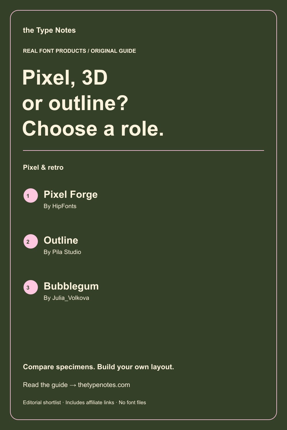
Your 3-product shortlist
Choose the role your font needs to play first. Each product below links to its exact Creative Fabrica listing, where you can inspect characters, current access, and the applicable license.
| Font product | Type direction | Try it for |
|---|---|---|
| Pixel Forge | Pixel display + 3D variant | A pixel headline with a listed 3D variant |
| Outline | Outline sans serif | A hollow sans-serif direction |
| Bubblegum | Bold display + outline + script | A rounded display with an outline component |
See the fonts and choose their roles
Selected from designer specimens and product information checked October 2, 2026. These are editorial starting points; test your own text and production method.
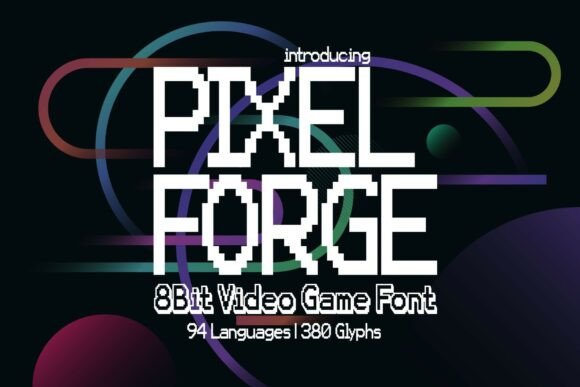
Pixel Forge
By HipFonts Check current access
A pixel headline with a listed 3D variant
Pixel Forge offers a concrete standard-versus-3D comparison within one product.
- Give it this role
- Let the dimensional word be the only heavy visual accent.
- Before you choose
- Compare the variants using the same phrase and available layout width.
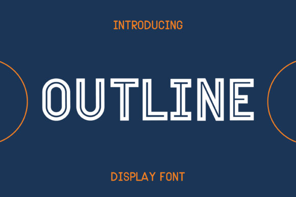
Outline
By Pila Studio Check current access
A hollow sans-serif direction
Outline by Pila Studio provides an outline alphabet rather than a pixel structure. It is useful for a different kind of lightness.
- Give it this role
- Use a short large word with solid supporting text.
- Before you choose
- Check stroke visibility on both your light and dark backgrounds.
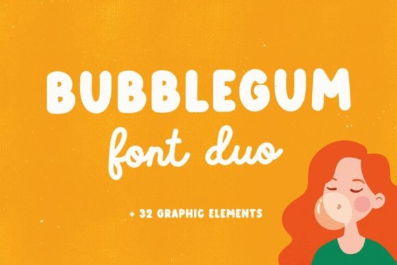
Bubblegum
By Julia_Volkova Check current access
A rounded display with an outline component
Julia_Volkova’s Bubblegum lets you compare filled and outline directions without changing the basic theme entirely.
- Give it this role
- One outline word with a plain, smaller subtitle.
- Before you choose
- Verify how the outline version reads after reducing the layout.
Build your own layout
- Build one flat version that reads clearly. This becomes the reference for every later treatment.
- Try one alternate: a listed 3D variant or an outline component. Leave room for its visible edges and any dimensional extension.
- Compare at thumbnail size and in the final output. Keep the effect only if it strengthens emphasis without changing the reading order.
Check the final result
- A software shadow is not the same thing as a font’s included 3D variant.
- Outline fonts need enough contrast for their thin edges.
- Check the exact product and designer because similar names can identify different fonts.
These recommendations are based on product information and designer specimens, not hands-on production testing. Inspect the exact listing, try your own text where a preview is available, and make a proof for your output method.
Choose your access and check the license
Product access can change. The access labels above describe what was shown when checked, not a promised price or permanent offer. Open each exact listing to confirm how you can obtain it and whether it is included in the plan you are considering.
For one project, compare buying only the fonts you need where a single purchase is offered. For several projects with different styles, compare the full subscription charge over the same billing period. A subscription listing does not mean a font is permanently free.
Read the terms for your purchase method and intended use, particularly editable templates, font embedding, and print-on-demand. Keep font files out of customer downloads unless the applicable terms expressly allow distribution.
Work through the subscription comparison or calculate your font budget.
Save the shortlist and compare your budget
Download the free font shortlist with product names, designers, style notes, and exact links. This is a free reference guide, not a download of font files. Product prices and access conditions vary.
Before choosing a plan, compare the fonts you actually expect to use over its full billing term. The font subscription calculator lets you model that comparison with your own prices.
Keep this guide on Pinterest.
Save a quick reminder and return to the full guide when you are planning your next product.
Keep exploring
Pixel fonts for retro graphics