Understand the direction
The gaps between blocks are part of the alphabet. A heavy edge or soft export can fill them and change the word’s shape. The goal is not the smallest possible font size; it is a short message that remains recognizable once the sticker is attached to an object.
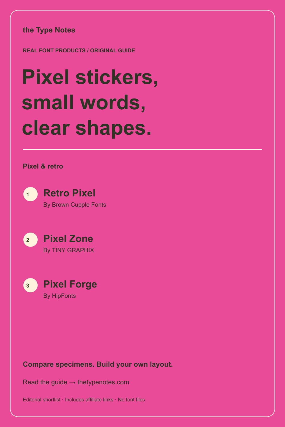
Your 3-product shortlist
Choose the role your font needs to play first. Each product below links to its exact Creative Fabrica listing, where you can inspect characters, current access, and the applicable license.
| Font product | Type direction | Try it for |
|---|---|---|
| Retro Pixel | Pixel display + italic | A short word with a visible grid |
| Pixel Zone | Retro pixel display | A different pixel rhythm for comparison |
| Pixel Forge | Pixel display + 3D variant | A flat-versus-dimensional decision |
See the fonts and choose their roles
Selected from designer specimens and product information checked October 2, 2026. These are editorial starting points; test your own text and production method.
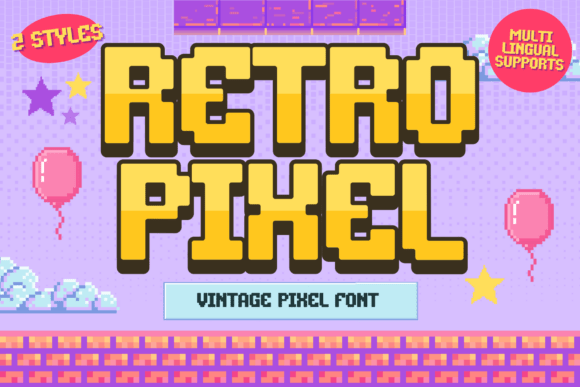
Retro Pixel
By Brown Cupple Fonts Check current access
A short word with a visible grid
The regular direction is a useful baseline before exploring a slanted or heavily styled treatment.
- Give it this role
- Start with a flat fill and a quiet background.
- Before you choose
- Print the longest word at the smallest intended sticker size.
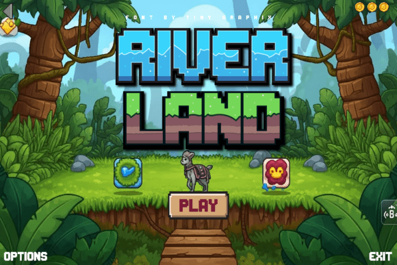
Pixel Zone
By TINY GRAPHIX Check current access
A different pixel rhythm for comparison
Pixel Zone gives you another alphabet to inspect if the first choice makes your word too wide or dense.
- Give it this role
- Let the word occupy most of the sticker’s usable area.
- Before you choose
- Compare the enclosed spaces and numerals with your actual content.
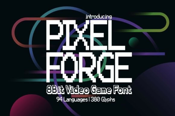
Pixel Forge
By HipFonts Check current access
A flat-versus-dimensional decision
The standard and 3D variants make the cost of extra decoration easy to compare in the same theme.
- Give it this role
- Use the simpler option when the final sticker is small.
- Before you choose
- Check the dimensional version separately; it may need more room than the standard one.
Build your own layout
- Make the minimum-size artboard, then place the full phrase without a shadow. Shorten the phrase if the letters cannot breathe.
- Export a print proof at the required size and resolution for your production workflow. Inspect both the word and its safe margin.
- Place the proof on a similar object and view it at a normal distance. Repeat with the most difficult word in the set.
Check the final result
- Do not assume a preview PNG is suitable as a production file.
- Test outline and shadow treatments separately from the base lettering.
- For cutting, inspect exported geometry and your actual material workflow.
These recommendations are based on product information and designer specimens, not hands-on production testing. Inspect the exact listing, try your own text where a preview is available, and make a proof for your output method.
Choose your access and check the license
Product access can change. The access labels above describe what was shown when checked, not a promised price or permanent offer. Open each exact listing to confirm how you can obtain it and whether it is included in the plan you are considering.
For one project, compare buying only the fonts you need where a single purchase is offered. For several projects with different styles, compare the full subscription charge over the same billing period. A subscription listing does not mean a font is permanently free.
Read the terms for your purchase method and intended use, particularly editable templates, font embedding, and print-on-demand. Keep font files out of customer downloads unless the applicable terms expressly allow distribution.
Work through the subscription comparison or calculate your font budget.
Save the shortlist and compare your budget
Download the free font shortlist with product names, designers, style notes, and exact links. This is a free reference guide, not a download of font files. Product prices and access conditions vary.
Before choosing a plan, compare the fonts you actually expect to use over its full billing term. The font subscription calculator lets you model that comparison with your own prices.
Keep this guide on Pinterest.
Save a quick reminder and return to the full guide when you are planning your next product.
Keep exploring
Pixel fonts for retro graphics