Understand the direction
Not every pixel font has the same density or rhythm. A roomy arcade headline and a compact information label have different jobs. Compare the letters using your real phrase rather than choosing only by a decade reference. The final export size can change how well a fine grid survives.
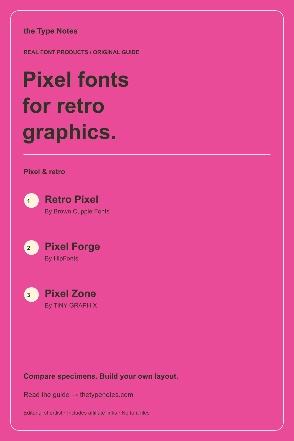
Your 3-product shortlist
Choose the role your font needs to play first. Each product below links to its exact Creative Fabrica listing, where you can inspect characters, current access, and the applicable license.
| Font product | Type direction | Try it for |
|---|---|---|
| Retro Pixel | Pixel display + italic | A clear retro display line |
| Pixel Forge | Pixel display + 3D variant | A display word with an optional dimensional direction |
| Pixel Zone | Retro pixel display | A compact retro display direction |
See the fonts and choose their roles
Selected from designer specimens and product information checked October 2, 2026. These are editorial starting points; test your own text and production method.
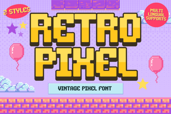
Retro Pixel
By Brown Cupple Fonts Check current access
A clear retro display line
Retro Pixel includes regular and italic directions in its listing, letting you compare a steady line with a more energetic treatment.
- Give it this role
- Use one pixel headline above plain supporting text.
- Before you choose
- Inspect diagonals and punctuation after export at the intended size.
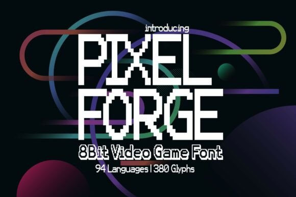
Pixel Forge
By HipFonts Check current access
A display word with an optional dimensional direction
Pixel Forge includes a standard and a 3D variant, useful for comparing a flat word with a more emphatic treatment.
- Give it this role
- Keep supporting information flat and uncomplicated.
- Before you choose
- Check whether the 3D version needs extra space between words and around edges.
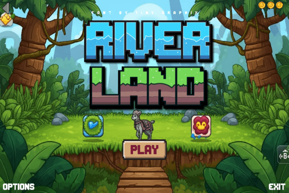
Pixel Zone
By TINY GRAPHIX Check current access
A compact retro display direction
Pixel Zone offers another pixel-based alphabet to compare when your phrase needs a different balance of density and width.
- Give it this role
- Use it for the headline rather than a dense paragraph.
- Before you choose
- Preview narrow letters, wide letters, and numerals in the exact listing.
Build your own layout
- Compare all candidates in black on cream at one output size. Choose the letter structure before choosing an effect.
- Try a short single line and a two-line version with a deliberate break. Preserve a consistent grid-like alignment.
- Export the final graphic and inspect the actual file at normal display size. Do not judge only the editor’s zoomed canvas.
Check the final result
- Repeated resizing can blur a rasterized preview.
- Keep required small information in a font that survives the target size.
- A retro mood does not require every decorative element to be pixelated.
These recommendations are based on product information and designer specimens, not hands-on production testing. Inspect the exact listing, try your own text where a preview is available, and make a proof for your output method.
Choose your access and check the license
Product access can change. The access labels above describe what was shown when checked, not a promised price or permanent offer. Open each exact listing to confirm how you can obtain it and whether it is included in the plan you are considering.
For one project, compare buying only the fonts you need where a single purchase is offered. For several projects with different styles, compare the full subscription charge over the same billing period. A subscription listing does not mean a font is permanently free.
Read the terms for your purchase method and intended use, particularly editable templates, font embedding, and print-on-demand. Keep font files out of customer downloads unless the applicable terms expressly allow distribution.
Work through the subscription comparison or calculate your font budget.
Save the shortlist and compare your budget
Download the free font shortlist with product names, designers, style notes, and exact links. This is a free reference guide, not a download of font files. Product prices and access conditions vary.
Before choosing a plan, compare the fonts you actually expect to use over its full billing term. The font subscription calculator lets you model that comparison with your own prices.
Keep this guide on Pinterest.
Save a quick reminder and return to the full guide when you are planning your next product.
Keep exploring
Pixel fonts for small sticker text